Hyperlocal Ordering, Simplified
This project redesigned a hyperlocal food ordering experience using a UX-led approach to reduce friction, simplify decisions, and improve clarity across the ordering journey.
Product Design
Project Overview
Client: BadiDukkan (Startup Concept)
Industry: Food Delivery · Local Commerce
Timeline: 3 Weeks (2023)
My Role: Lead UI/UX Designer
About the Brand
Founded in 2020 by Abhishek Kasaudhan, BadiDukkan was built with a simple philosophy:
“Make ordering simple — for customers and restaurants alike.”
Unlike large delivery apps, BadiDukkan charges 0% commission, giving local restaurants a chance to grow without losing revenue to fees.
The vision was not to disrupt the industry overnight, but to improve everyday ordering through small, meaningful improvements.
The Challenge
Local restaurants struggle with:
High commissions from big food delivery platforms
Limited control over menu design & branding
Poor customer experience on generic apps
Lack of direct, loyal relationships with customers
BadiDukkan wanted a design solution that:
Felt simple, fast, and intuitive
Highlighted the restaurant identity, not the app brand
Reduced friction in ordering
Allowed restaurants to thrive without commissions
The Goal
To design a clean, minimal, commission-free food ordering app that prioritises:
Simplicity . Speed . Transparency . Local restaurant visibility . Trust-building through clear ordering flows
My Design Approach
1. Research & Understanding User Intent
Analysed popular apps like Zomato and Swiggy
Identified friction points: clutter, heavy promotions, too many steps
Mapped a user flow that reduces clicks and cognitive load
2. Brand Positioning
Since BadiDukkan supports small businesses, the UI had to feel:
Neutral yet premium
Minimal but warm
Easy for all age groups
Non-commercial and clean
Chosen visual language: soft whites, clean typography, warm accents to match local commerce.
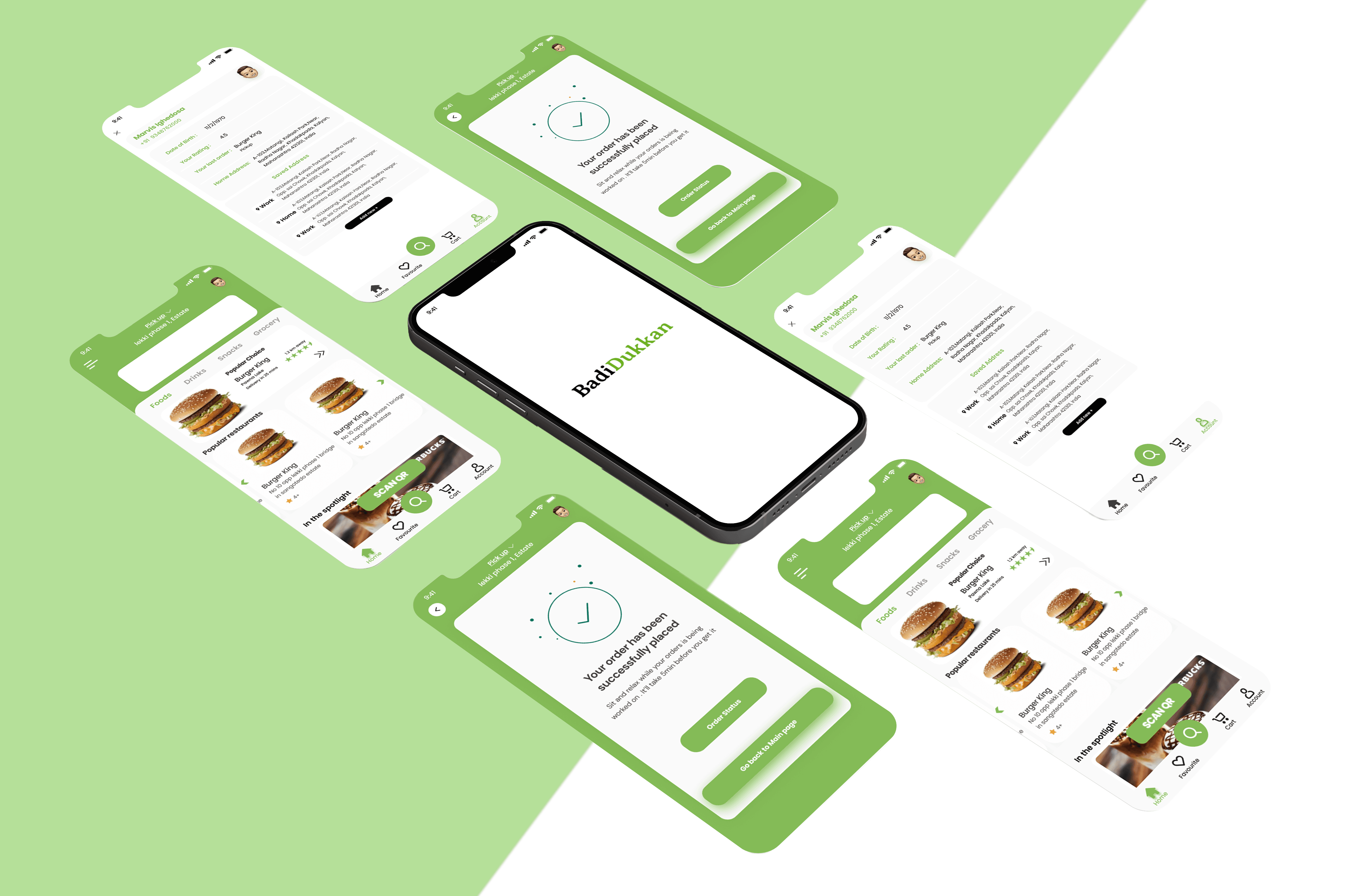
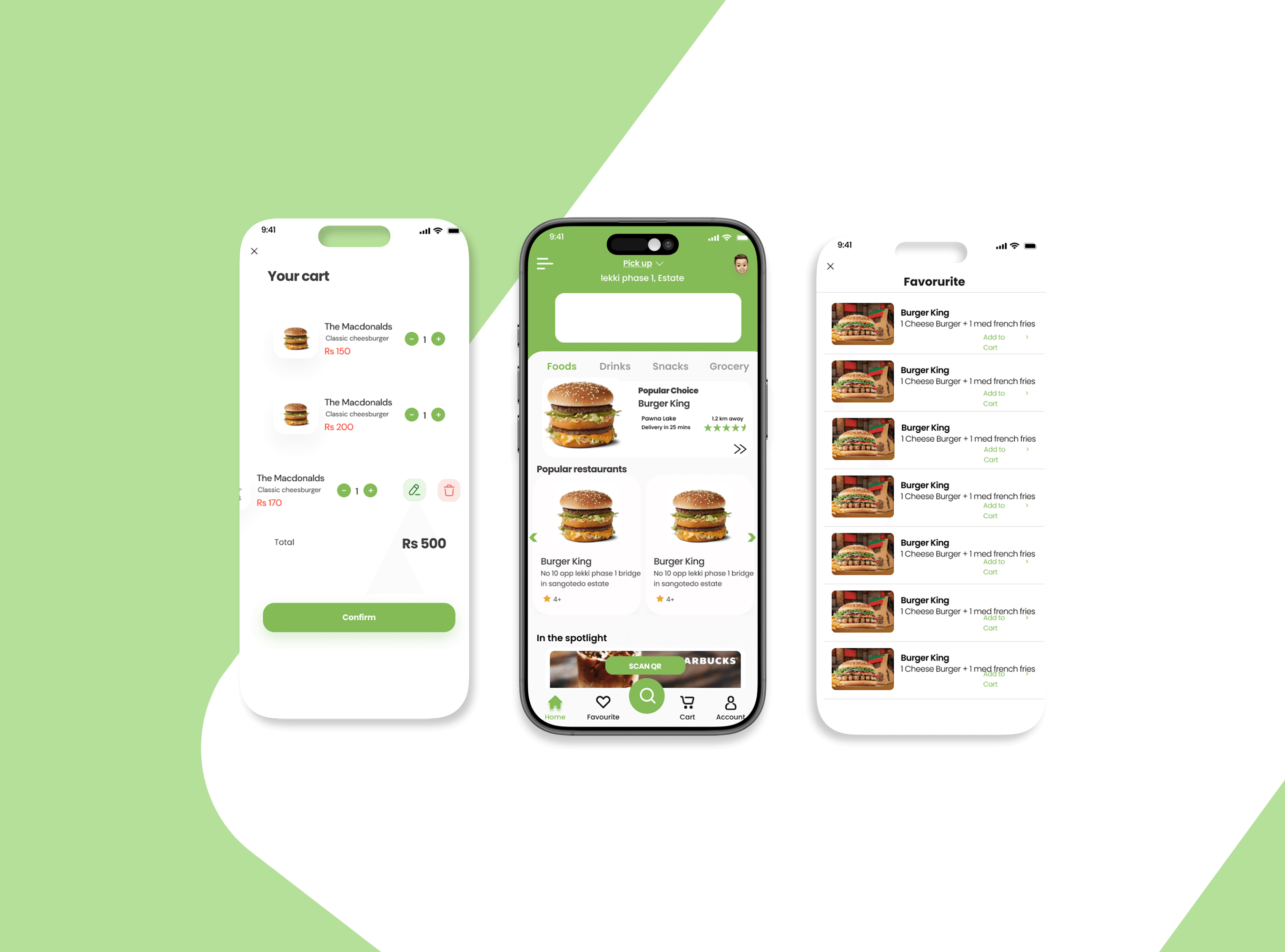
3. High-Fidelity UI Design
Built screens that communicated:
Home: simple category browsing
Restaurant Page: high emphasis on food photography
Menu: clean, breathing space, clear call-to-action
Cart: transparent pricing, no hidden fees
Order Tracking: fast, friendly, real-time updates
4. Mobile Mockups & Storytelling
Created polished mockups to communicate real-world use cases.