A mobile ordering concept that reduces promotional clutter, makes pricing easier to understand and gives local restaurants greater visibility throughout the customer journey.
BadiDukkan
10 weeks · 2024
Lead UI/UX Designer
Product Design · Mobile UI/UX
Overview
BadiDukkan is a hyperlocal food-ordering concept founded around a zero-commission model. Its proposition is to help local restaurants accept digital orders without losing a percentage of each transaction to a large delivery platform.
The project explored how this restaurant-first business model could be reflected in the customer experience. Instead of creating another promotion-heavy ordering interface, I focused on making it easier for users to discover restaurants, understand menus, review pricing and complete an order.
I was responsible for reviewing comparable products, identifying recurring interface problems, mapping the ordering journey and creating the high-fidelity mobile interface.
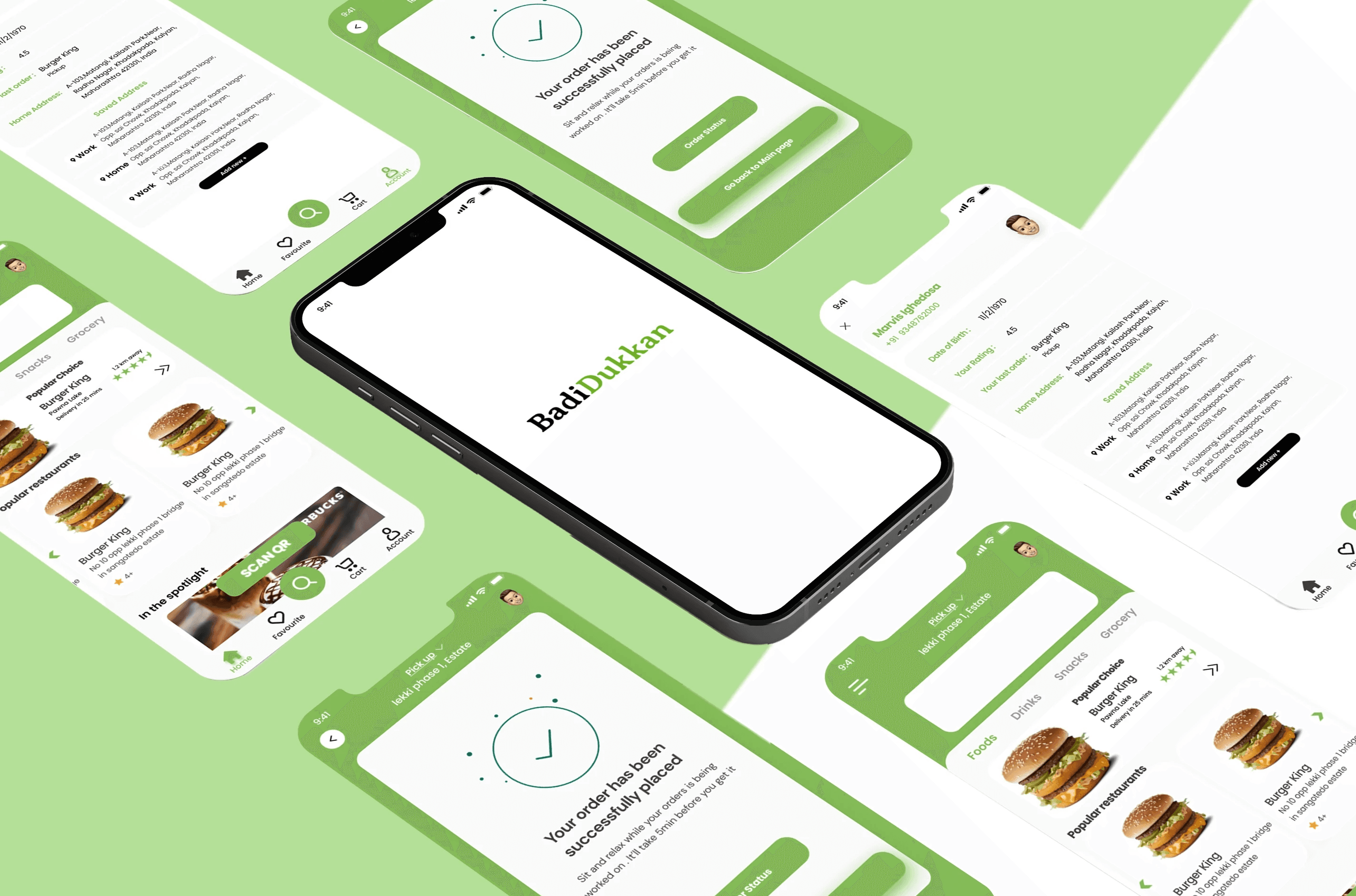
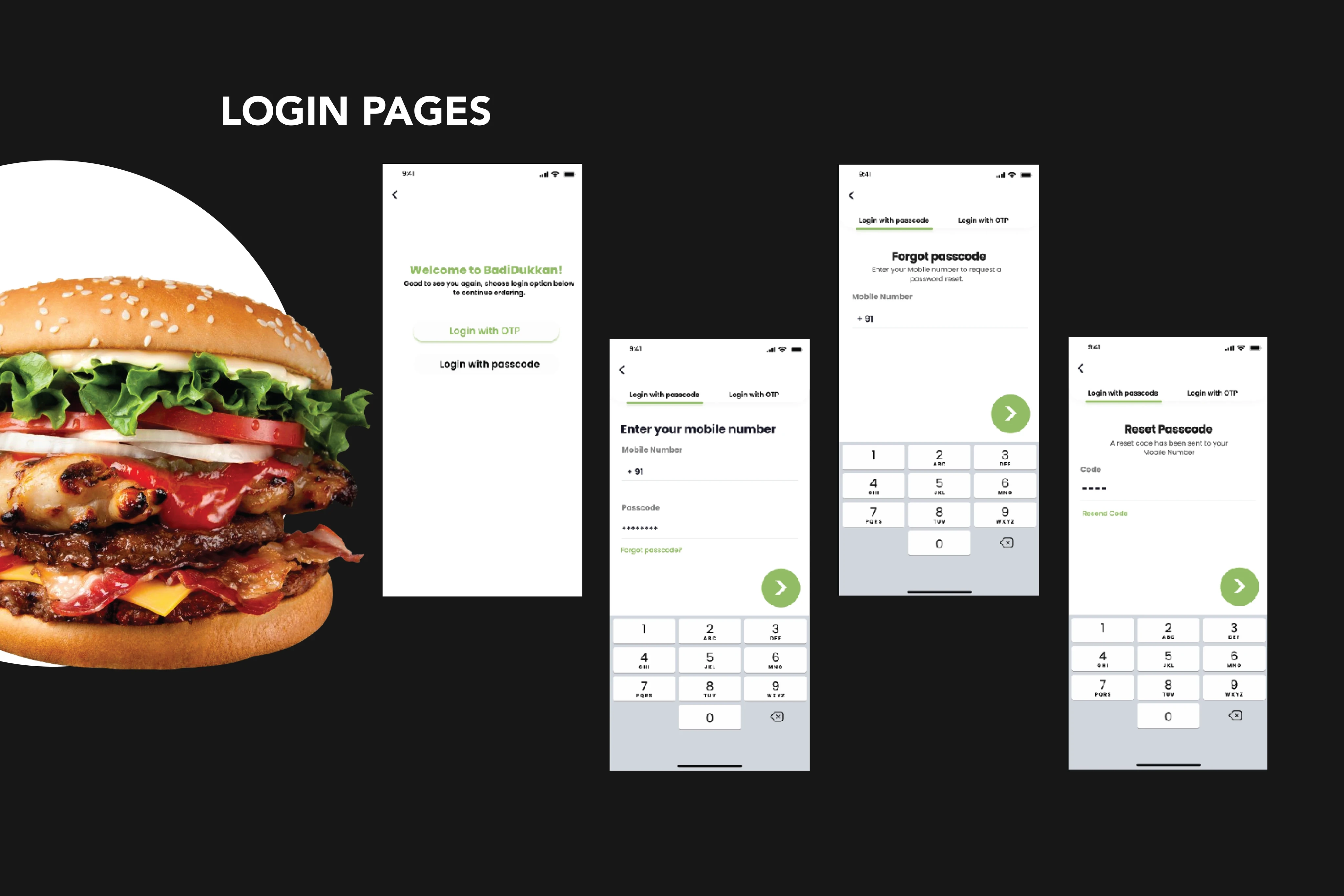
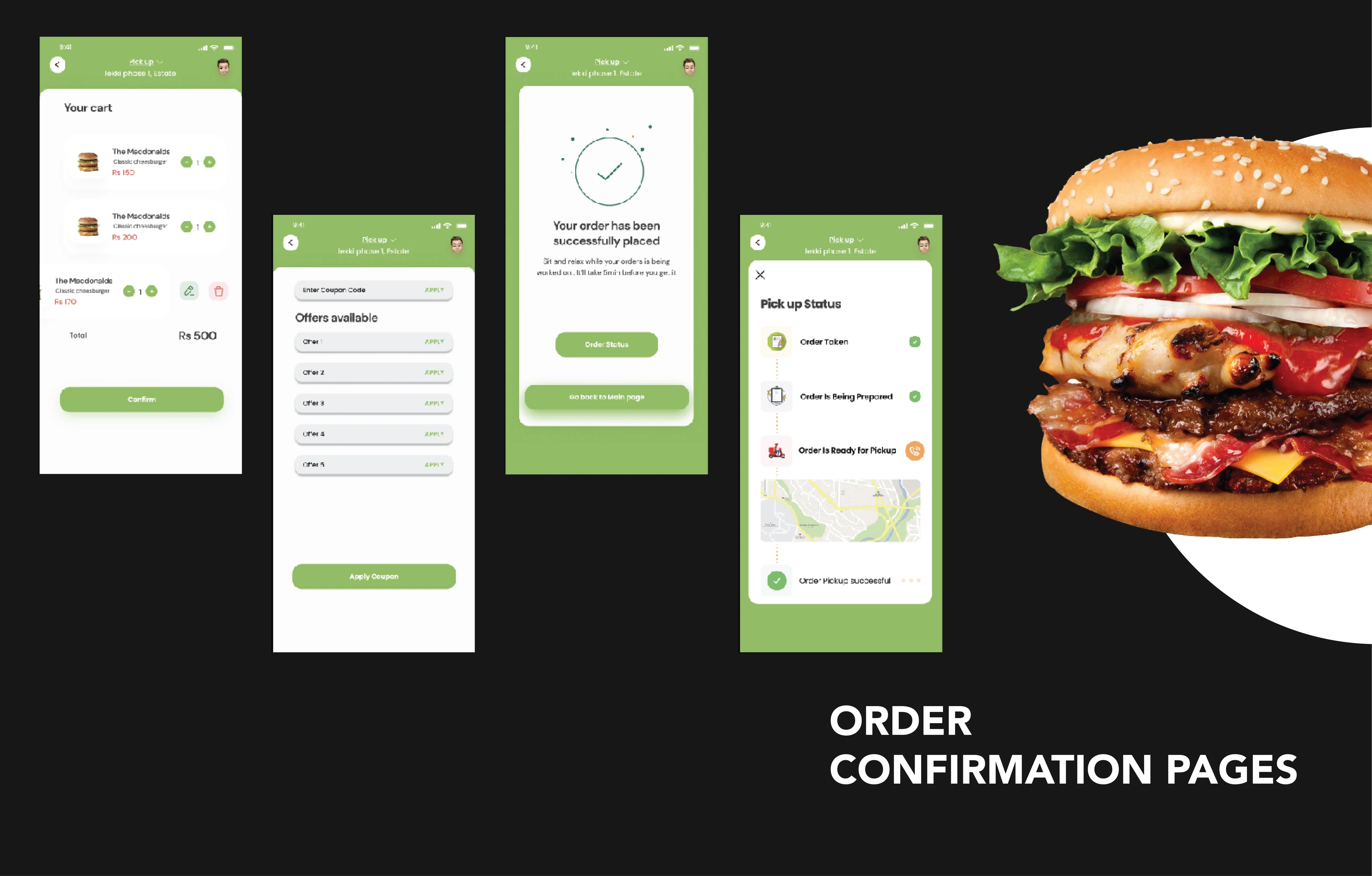
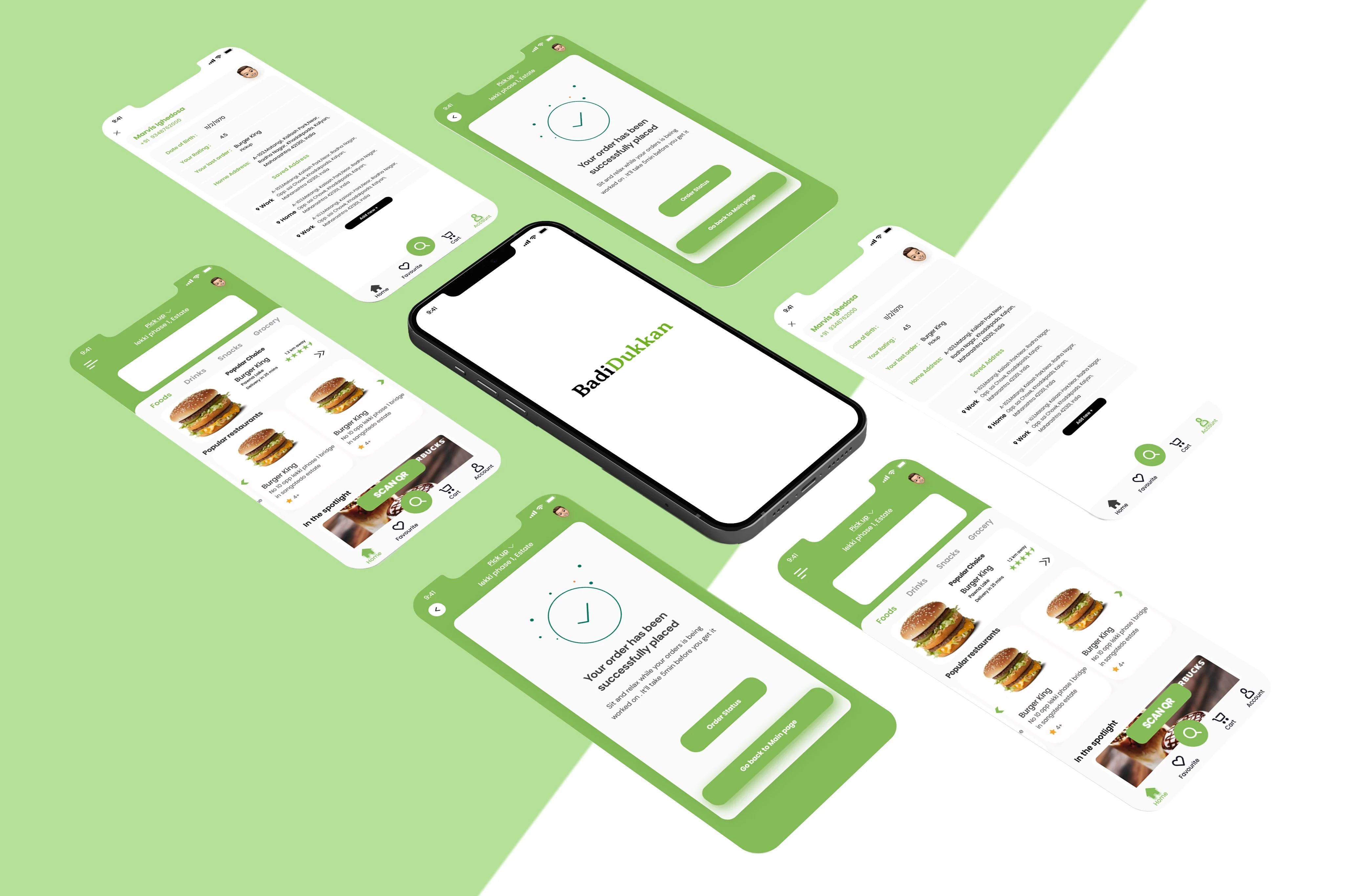
The final concept covers the main customer journey from category browsing and restaurant discovery through to menu selection, cart review and order tracking
Challenges
Large food-delivery applications need to present extensive catalogues, promotions, advertisements, recommendations and loyalty programmes within the same interface. While these features support the platform’s commercial model, they can make simple ordering tasks feel crowded.
Restaurants can also lose their individual identity when every listing follows the same platform-led format. For a service positioned around supporting local businesses, the design needed to place greater emphasis on the restaurant and its food.
BadiDukkan’s zero-commission proposition introduced another important expectation: transparency. The checkout experience needed to make costs easy to understand and avoid the sense of discovering unexpected fees at the final stage.
The central challenge was to create an interface that felt simpler than established delivery platforms without becoming unfamiliar or removing information customers needed to make decisions.
Design Approach
I reviewed established platforms such as Zomato and Swiggy to understand familiar ordering patterns and identify areas where the experience became unnecessarily demanding.
The review highlighted three recurring issues: crowded discovery screens, strong competition between promotional elements and important actions, and additional decisions appearing late in the checkout journey.
I mapped a shorter ordering flow around the user’s primary task. The experience begins with categories and nearby options, moves into a restaurant-led menu and keeps pricing information visible before confirmation.
The visual direction was deliberately neutral so the interface would not compete with each restaurant’s identity. Soft white backgrounds, warm accent colours, clear typography and generous spacing create structure while allowing food photography to remain prominent.
I designed the screens at high fidelity to evaluate hierarchy, spacing, calls to action and continuity across the journey.
Goals
The goal was to create a clear mobile ordering journey based on simplicity, speed, transparency and local restaurant visibility.
The experience needed to help customers:
Find relevant food or restaurants quickly
Understand a restaurant’s offering without excessive navigation
Scan menu items and make selections confidently
Review costs before placing an order
Follow the order through clear status updates
The product also needed to communicate BadiDukkan’s restaurant-first positioning without turning every screen into an explanation of its business model.
Success at this stage meant producing a coherent, high-fidelity concept with a logical path through the principal ordering tasks. The project did not include development or live-product measurement.
Solution
The final design organises the experience around five connected stages.
The home screen uses simple categories and restaurant imagery to support quick discovery. Restaurant pages place food, identity and essential service information ahead of platform promotions.
Menus use clear grouping, spacing and visible actions to support scanning. The cart consolidates selections and pricing so customers can understand the order before proceeding. The tracking experience uses clear, friendly status updates rather than presenting excessive operational detail.
Across the interface, promotional noise is deliberately limited. Visual emphasis is placed on the restaurant, menu items, price and next required action.
The product retains familiar mobile-ordering patterns, reducing the need for users to learn a new interaction model while still offering a calmer visual experience.


Outcome
The project produced a coherent high-fidelity concept demonstrating how BadiDukkan’s zero-commission and restaurant-first positioning could translate into a customer-facing product.
The interface establishes a consistent visual system and shows the complete principal ordering journey. It also provides a foundation that could be extended into restaurant onboarding, account management, repeat ordering and operational tools.
Because this was a design concept, it was not launched and no usability or conversion data were collected. Reduced friction and improved pricing clarity are intended outcomes based on the design decisions, not verified performance claims.
Reflection
This project demonstrated that simplifying a transactional experience is largely an exercise in prioritisation. Each screen needs to help the user make one clear decision without hiding information that may affect trust.
The restaurant-first proposition was most successful when expressed through hierarchy rather than repeated marketing messages. Allowing photography, menu content and restaurant information to lead made the interface feel more aligned with the business model.
If developed further, I would test the flow with both customers and restaurant owners. Customer testing would focus on discovery, menu comprehension and checkout transparency. Restaurant research would explore menu management, order operations and how much control businesses need over their storefront presentation.