A character-led website and marketing system that makes complex facility-management software easier to understand through relatable roles, operational scenarios and a cohesive visual story.
Eaco Systems
2024–2025
Lead Product Designer · UI/UX Designer · Marketing Designer
UI/UX Design · Web Design · Product Marketing
Overview
Eaco is an operations and facility-management platform designed to help service businesses manage scheduling, employees, contractors, assets, timesheets, works, invoicing and reporting from one connected system.
The platform offered a broad range of capabilities, but the existing website did not communicate them in a clear or engaging way. Product information was organised around features, making it difficult for new visitors to understand how those tools related to their responsibilities or everyday operational problems.
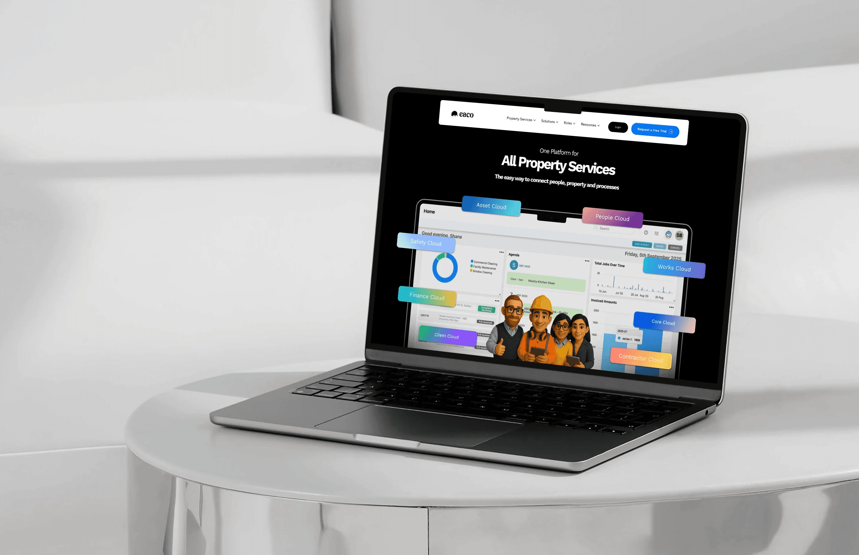
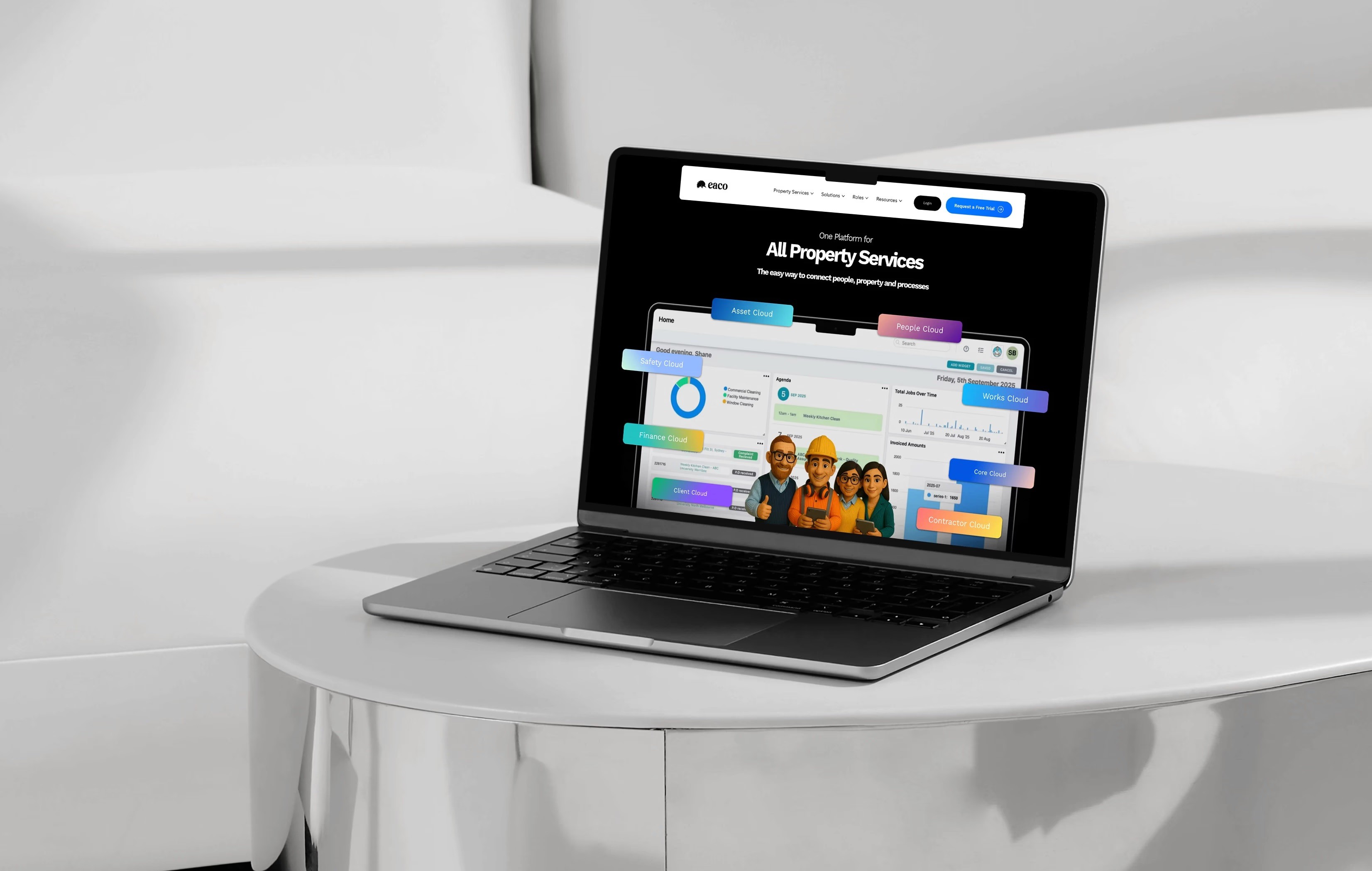
I led the end-to-end redesign of Eaco’s website and supporting visual system. My work included restructuring the information architecture, defining page hierarchies, creating responsive Figma prototypes and implementing the final experience in Wix Studio.
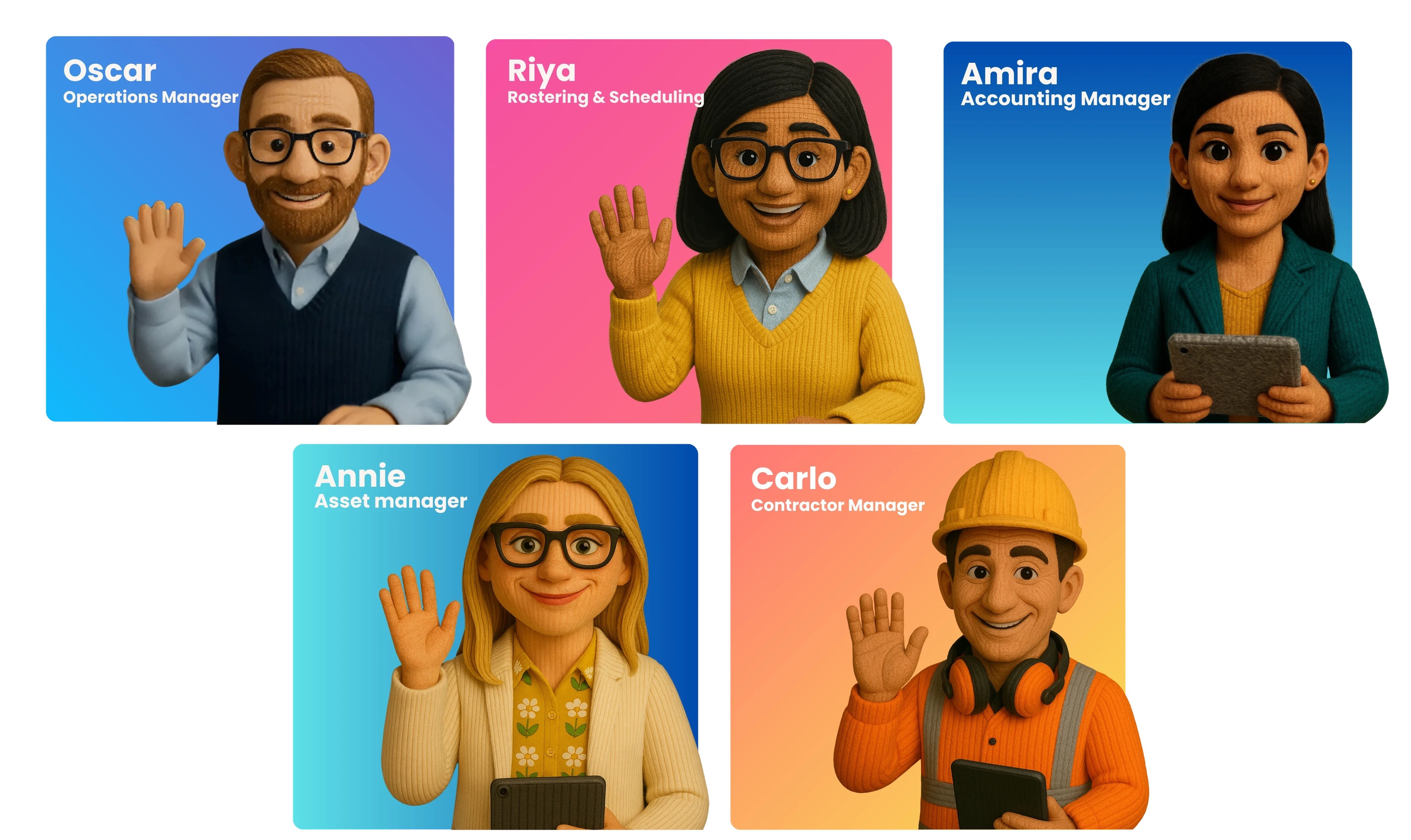
I also developed a character-led storytelling system centred on Oscar, an operations manager navigating the pressures of service delivery. Oscar introduces other role-based characters, each representing a key area of the Eaco platform. This system extended beyond the main website into landing pages, calculators, lead magnets, product campaigns, social advertising and short-form video.
Challenges
Eaco’s original website described what the software could do, but it did not always explain why those capabilities mattered to different users.
Facility-management software involves multiple connected workflows. An operations manager may need to coordinate staff, handle last-minute scheduling changes, monitor contractors, track assets, confirm completed work and make sure jobs are invoiced correctly. Presenting each capability as an isolated feature made the platform feel more complicated than the problems it was designed to solve.
The website also needed to speak to several audiences, including commercial cleaning businesses, facility-management companies, tradespeople and service providers. Each audience entered the website with different priorities, levels of technical knowledge and operational challenges.
The main communication problems were:
Dense product descriptions created a high reading load
Features were not consistently connected to real workplace scenarios
Different users struggled to identify which parts of the platform were relevant to them
The website, campaigns and sales material lacked one recognisable narrative
New pages and campaigns needed a more scalable design system
The challenge was therefore larger than redesigning individual pages. I needed to create a framework that could explain an interconnected product clearly while also giving Eaco a stronger and more memorable identity.


Design Approach
I began by reorganising the website around the questions potential customers were likely to have: What problem does Eaco solve? Is it relevant to my business? Which workflows can it improve? What should I explore next?
This led to a revised information architecture covering solutions, industries, operational roles, resources, calculators and conversion-focused landing pages. I created wireframes to test how these content groups could work together before developing the visual interface.
The central storytelling decision was to introduce Eaco through recognisable workplace roles:
Oscar represents operations management
Riya represents rostering and scheduling
Carlos represents contractor management
Annie represents asset management
Amira represents finance and invoicing
Oscar acts as the primary guide. Instead of presenting software modules immediately, the website begins with the pressure of managing people, jobs, assets and costs. Each supporting character enters when a particular operational problem appears.
I developed the responsive interface in Figma using modular sections, strong typographic hierarchy and consistent calls to action. I then implemented and refined the pages in Wix Studio.
AI-assisted tools supported early character exploration, visual variations and campaign content. My role was to direct the visual style, maintain consistency, select and refine outputs, integrate the characters into the layouts and ensure the visuals supported the product story.
Goal
The goal was to reposition Eaco’s website as a clear introduction to the product rather than a catalogue of software features.
The experience needed to help visitors recognise their own operational problems, understand which Eaco tools could support them and move towards a relevant action, such as exploring a solution, using a calculator or requesting a demonstration.
The redesigned system also needed to:
Organise a large amount of information without overwhelming visitors
Support different roles, industries and stages of product awareness
Create consistency across the website and marketing activity
Provide reusable structures for future landing pages and product releases
Work effectively across desktop, tablet and mobile
Rather than removing important product detail, the objective was to reveal it progressively. Visitors could begin with a familiar problem or role and then explore the relevant capabilities in more depth.
Solution
The homepage introduces Eaco through operational scenarios before guiding visitors towards relevant solutions. Role pages allow visitors to explore the platform from the perspective of the person responsible for that work, while solution pages provide more detailed explanations of individual capabilities.
The visual system uses clean, grid-based layouts, controlled brand colours and generous spacing to balance the personality of the characters with the credibility expected from B2B software.
The system was extended across:
Role-based product pages
Industry-specific landing pages
Scheduling and product-release campaigns
School, retail and warehouse cleaning quote calculators
A Manual Work Audit
Compliance resources and lead magnets
Maintenance schedule content
Social advertisements, email campaigns and short videos
This created a connected communication system rather than a collection of unrelated assets. The characters provided familiarity, while the modular page structure allowed Eaco to introduce new features and campaigns without redesigning the experience each time.

Outcome
The redesigned website was launched as Eaco’s primary digital presence. It established a clearer hierarchy across the company’s solutions, industries, resources and operational roles.
The role-based framework also gave Eaco a recognisable way to communicate product capabilities across website pages, social content, videos and campaigns. New material could be connected to a relevant role or scenario instead of starting with an abstract list of features.
The calculator pages became active lead-generation touchpoints. Based on internal reporting during my time at Eaco, the established calculators typically generated approximately two to three leads per week. This result relates to the broader calculator programme and should not be interpreted as a controlled measure of the website redesign alone.
The project also produced a reusable foundation for future product pages, campaigns and resources. No formal usability study or controlled before-and-after website analysis was completed, so improvements in comprehension and brand recall remain intended design outcomes rather than verified claims.

Reflection
This project strengthened my ability to work across product communication, visual design, marketing and implementation as one connected design problem.
The most important decision was shifting the website’s starting point from software features to human responsibilities. The characters were not added simply as decoration; each one created a consistent way to group information and connect a product capability to a recognisable workplace problem.
The project also taught me to balance personality with clarity. A character-led experience can make enterprise software feel more approachable, but the interface still needs strong hierarchy, credible product detail and clear routes towards conversion.
If I continued developing the system, I would conduct structured usability sessions with different operational roles and compare how quickly participants could identify relevant solutions. I would also establish consistent analytics for role pages and calculators to measure engagement and conversion over time.