An independent campaign concept challenging the judgement directed at outgoing women through provocative copy, unpolished photography and an unapologetic urban visual identity.
Independent concept for Diesel
3 weeks · 2023
Art Director · Visual Designer · Copywriter
Art Direction · Campaign Design · Visual Design

Overview
LOOSE is an independent campaign concept that examines the stereotypes applied to women who enjoy nightlife, parties and drinking.
The project responds to the way women’s social choices are sometimes treated as evidence of their character. It reframes being “loose” as freedom from judgement: the freedom to be visible, sociable, imperfect and self-directed.
I developed the central concept, campaign language, copywriting, visual direction, poster system and outdoor mock-ups.
Diesel was selected as the conceptual brand setting because its advertising has historically embraced provocation, rebellion and individuality. The project was not commissioned, approved or published by Diesel and should always be identified as an independent concept.
Challenges
Women who are confident, outgoing or comfortable within nightlife settings are often judged through outdated assumptions. Their clothing, behaviour or alcohol consumption may be interpreted as an invitation to question their values, boundaries or intentions.
A campaign addressing this issue could easily become overly explanatory or disconnected from the visual language of fashion advertising. It needed to challenge the stereotype without presenting women as passive subjects requiring approval or protection.
The concept also needed to handle the word “loose” carefully. Rather than ignoring its negative use, the campaign needed to confront and reclaim it.
The creative challenge was to build a message that felt emotionally meaningful and socially aware while remaining bold, visually immediate and appropriate for a provocative fashion context.
Design Approach
I developed the visual direction around a deliberate contrast: a message that is loud and confrontational, expressed through images that also reveal vulnerability and emotional realism.
Strong condensed typography gives the campaign confidence and visibility. Rounded speech-bubble forms soften the composition and suggest that the statements come directly from the women pictured.
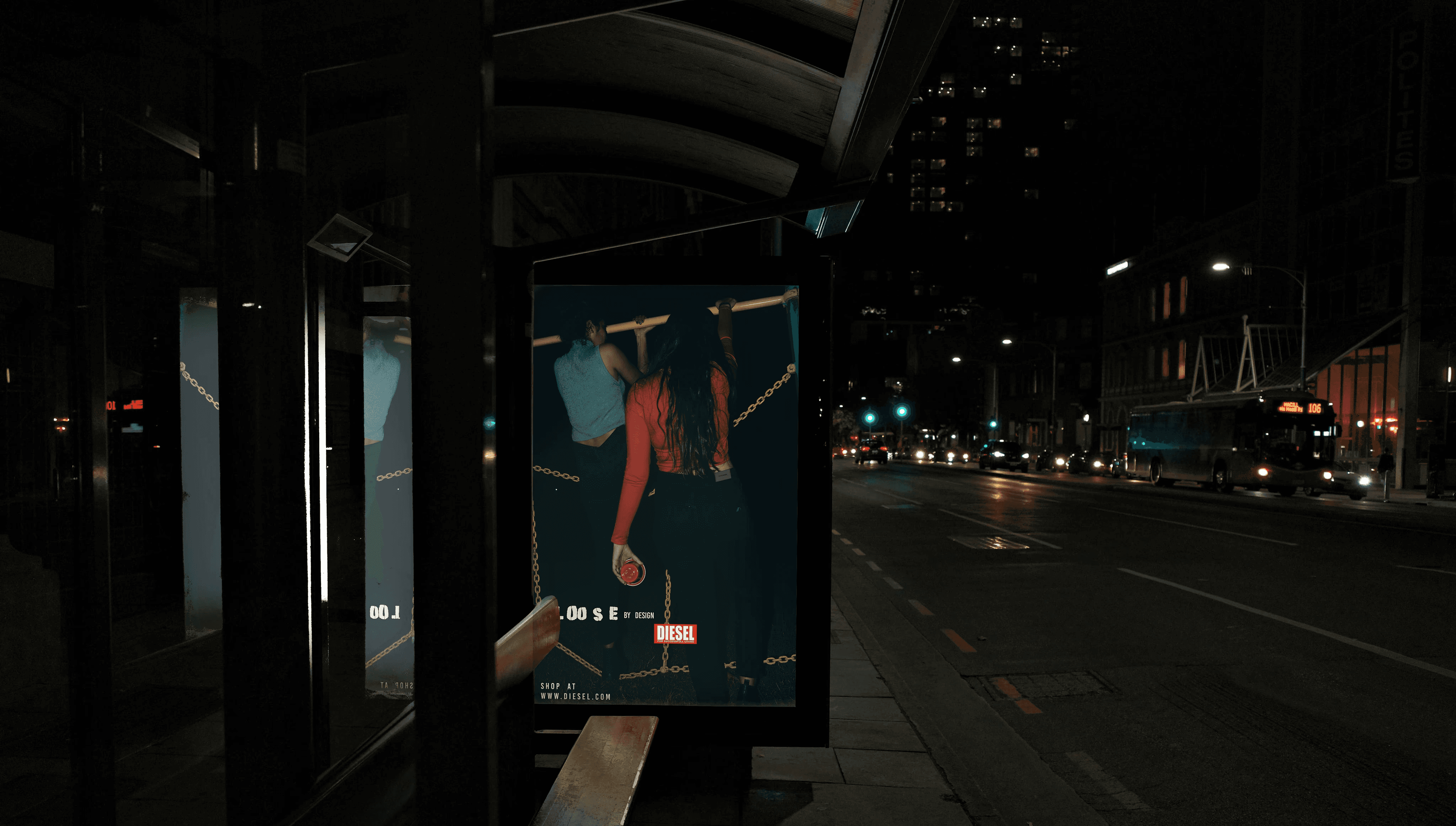
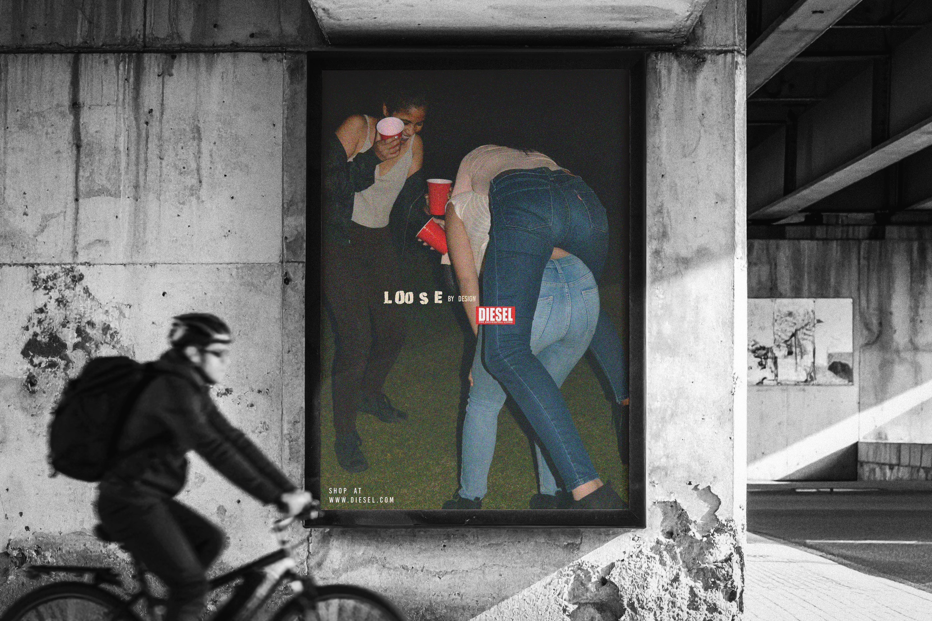
The photography avoids polished fashion poses. Grain, imperfect lighting, movement, deep shadows and unguarded expressions create a more immediate atmosphere. The images show nightlife as energetic, intimate, messy and human rather than presenting an idealised “party girl” stereotype.
The colour palette remains muted, allowing skin tones, shadows, red cups and selected accents to carry emotional weight.
The copywriting tone is concise, personal and unapologetic. The campaign does not ask the audience for permission or validation; it presents each woman as the author of her choices.
Goal
The goal was to reposition “loose” as a statement of personal agency rather than a judgement of character.
The campaign sought to:
Challenge stereotypes surrounding women and nightlife
Separate personal choices from assumptions about character
Celebrate freedom, confidence and self-expression
Create a message that felt direct rather than apologetic
Align the concept with Diesel’s rebellious brand world
The message needed to work quickly within outdoor advertising. Viewers should be able to understand the emotional position of the campaign through the relationship between the portrait, headline and environment.
Solution
The final campaign combines raw portraiture, disruptive typography and direct statements across three outdoor environments.
The night-time shelter places an intimate visual within a public setting. Rain, reflections and artificial light strengthen the feeling of vulnerability while the scale of the poster makes the statement impossible to ignore.
The urban bus-stop execution uses movement and an unpolished nightlife moment. The surrounding traffic and street lighting make the artwork feel connected to the environment rather than isolated inside a gallery-like frame.
The underpass billboard uses a larger group image centred on friendship, chaos and shared energy. Its concrete setting and large scale reinforce Diesel’s anti-perfection attitude.
Together, the applications demonstrate how the campaign could retain one recognisable system while adapting to different images, messages and outdoor formats.
Outcome
The project resulted in a cohesive independent campaign system spanning concept development, art direction, copywriting, poster design and environmental mock-ups.
It demonstrates my ability to connect a cultural observation with a visual language appropriate to a specific brand context. The final work balances social commentary with the speed and visual impact required by outdoor fashion advertising.
Because LOOSE was a self-initiated concept, it was not released publicly and has no audience, engagement or campaign-performance results. Its outcome is the completed campaign system and the design thinking demonstrated through its development.
Reflection
LOOSE gave me the opportunity to treat copy, typography, photography and placement as one connected system rather than separate design elements.
The strongest part of the campaign is the tension between confrontation and vulnerability. The typography demands attention, while the portraits create a more personal emotional response. That contrast prevents the message from feeling like a generic empowerment campaign.
The project also highlighted the importance of representation when designing around a social issue. One visual perspective cannot represent every woman’s relationship with nightlife, confidence or judgement.
If I extended the campaign, I would include a wider range of identities, ages, body types and personal experiences. I would also explore short films, social content and first-person stories while ensuring the central message remained concise and self-directed.